Analytical Dashboard
See the real money each campaign makes - not just revenue.
Most discount apps only tell you how much you sold. Discount Prime tells you how much you actually kept. Net margin is computed from your real Shopify costs, discounts, and shipping promotions so you can compare campaigns apples-to-apples.
Watch it in action
Analytical Dashboard walkthrough
More walkthroughs on the @DiscountPrimeApp YouTube channel.
What you get
Revenue & discounts over time
30-day trend of sales volume and discounts given, updated continuously as orders come in.
Top campaigns & revenue mix
See which campaigns drove the most revenue and how the mix breaks down across BOGO, tiered, flat, full-price and shipping.
Recent orders with margin health
Live feed of latest orders with total, discount, estimated profit and delivery cost, color-coded Loss / Thin / Healthy.
How it works
- 1Discount Prime reads variant cost and shipping cost from Shopify on every order.
- 2Each discount line is attributed to the campaign that fired it.
- 3Margin and ROI are recalculated continuously so reports are always live.
Inside the dashboard
What you see in the Analytics Dashboard
From the 30-day revenue & discount trend down to a single order breakdown. Every view is calculated from your real Shopify costs.
Preview the dashboard before your first order lands
You don't have to wait for real orders to roll in to understand how the Analytics Dashboard will work for your store. We ship the dashboard with a realistic sample dataset so you can explore every chart, KPI card, campaign breakdown, revenue mix and recent-orders row exactly as they'll appear once your campaigns go live. Flip into sample mode, click around, and get a feel for how revenue, estimated profit, ROI and discount given are visualized, then exit preview the moment your own data starts flowing in.
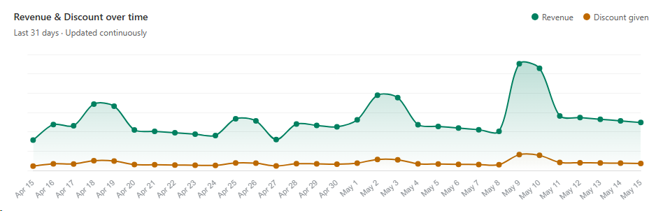
1. Revenue & discounts over time
Track sales volume and the discounts you've given over the last 30 days, updated continuously.
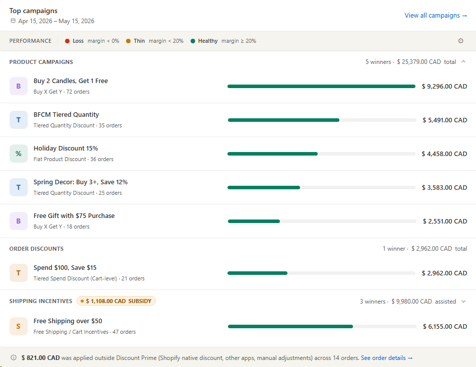
2. Top campaigns performance
See which campaigns drove the most revenue, grouped by product, order, and shipping incentives, color-coded by margin health.
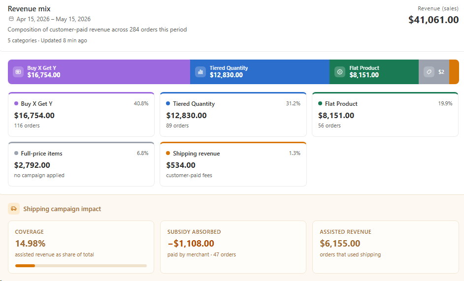
3. Revenue mix
Understand how your customer-paid revenue breaks down across BOGO, tiered, flat, full-price, and shipping, plus the shipping subsidy impact.
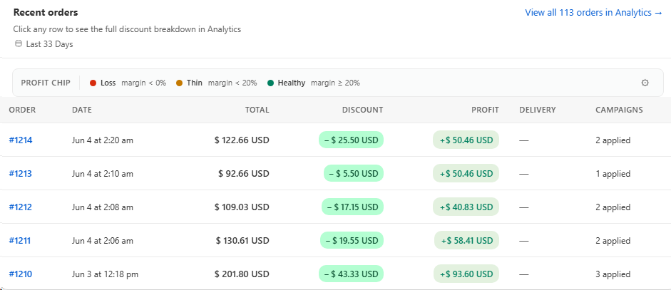
4. Recent orders feed
A live feed of your latest orders with total, discount given, estimated profit, delivery cost, and how many campaigns applied to each one. Every row is color-coded by margin health (Loss < 0%, Thin < 20%, Healthy ≥ 20%) so you instantly spot the orders that are bleeding profit, and you can click any row to jump into Analytics for the full discount breakdown.
Best for
Margin-conscious merchandising and finance teams.