Analytics
Campaign-level analytics for every discount you run.
Analytics gives you the full funnel for every discount campaign - from widget impression to checkout - so you can see which offers actually move the needle and which ones quietly underperform.
What you get
Revenue & discount trend
Daily revenue, discount given and order count over any range, with a 30-day overview out of the box.
Top campaigns leaderboard
Rank every active rule by revenue, orders and conversion so you instantly see which discounts move the needle.
Order-level drill-down
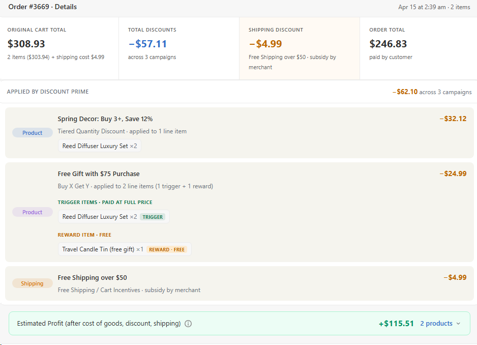
Open any order to see exactly which campaigns applied, how much was discounted and the revenue lift attributed to each.
How it works
- 1Discount Prime instruments every widget impression and interaction.
- 2Events are tied to the campaign and variant that triggered them.
- 3Reports update in near real time so you can iterate the same day.
Inside the dashboard
What you see in Analytics
Full-funnel campaign metrics plus order-level drill-down so you can attribute every discount to its source.
1. Performance overview
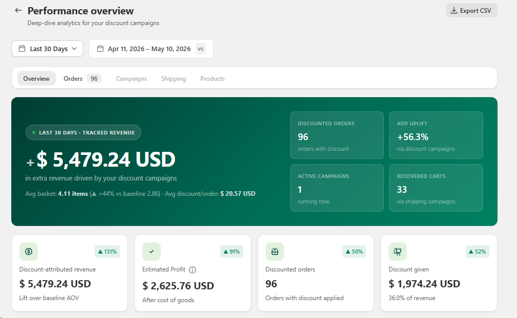
The top of Analytics gives you a single deep-dive snapshot of how your discount campaigns are actually performing. Pick any range (Last 30 Days by default) and compare it side-by-side with the previous period, then switch between Overview, Orders, Campaigns, Shipping and Products tabs without leaving the page. The hero card highlights tracked revenue lifted by discounts (+$5,479.24 here), the average basket size and average discount per order, plus four KPI tiles: discounted orders, AOV uplift vs baseline, currently running campaigns and carts recovered through shipping incentives. Below it, four metric cards break out discount-attributed revenue, estimated profit after cost of goods, total discounted orders and total discount given, each with its trend vs the previous period so you instantly see what's growing and what's costing you. Export the whole view to CSV in one click for finance or reporting.
2. Revenue lift over time
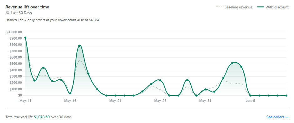
This is where Analytics gets strategic. The Revenue lift chart plots your real with-discount daily revenue (solid green line) against a baseline (dashed line) calculated from your own no-discount AOV, so you can see exactly how much extra revenue your campaigns are actually generating versus what the same traffic would have spent at full price. Switch the range to Last 7 / 30 / 90 days or a custom window to study short bursts (BFCM, a flash sale, a new launch) or long-term trends, and the footer surfaces the Total tracked lift for that period (here +$1,078.60 over 30 days). Use it to decide which campaigns deserve to keep running, which time windows convert best, and how aggressive your next discount strategy should be. Click See orders to jump straight into the order-level breakdown for any spike.

3. Revenue milestones
Right below the lift chart, Analytics shows you a Milestone reached banner that tracks the cumulative revenue Discount Prime has driven for your store since you installed it. You see exactly how much tracked revenue you've crossed so far ($7,854.47 here), what percentage of the next milestone you've reached (79% of $10,000), and a benchmark line that tells you where the median store in your category lands (the median apparel store reaches $50,000 within their first 12 months). It's a quick, motivating gut-check on whether your discount program is pacing ahead of, on, or behind comparable stores, so you can celebrate the wins and know when it's time to push harder.
4. Top performing campaigns
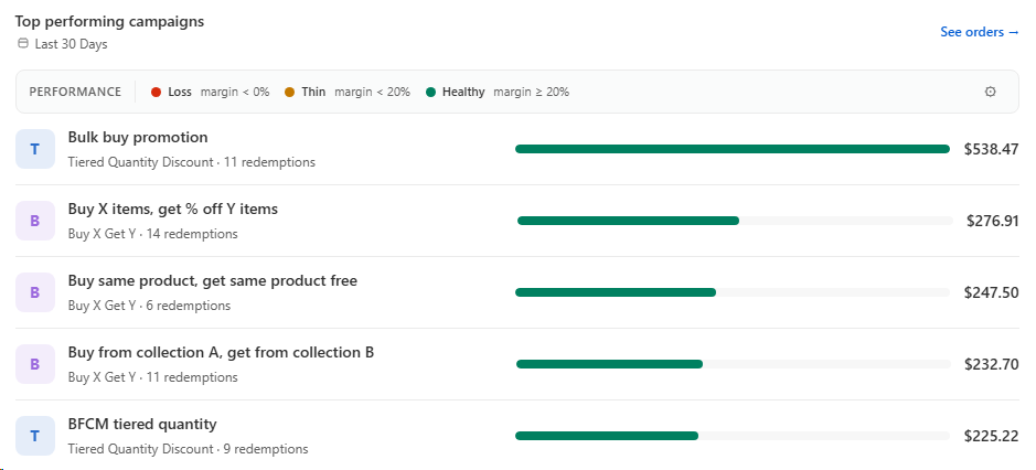
Next, Analytics ranks every campaign you've ever launched by the revenue it actually generated in the selected period, so you can stop guessing which offers move the needle. Each row shows the campaign name, its type (Tiered Quantity, Buy X Get Y, Flat, Shipping, etc.), how many times it was redeemed, a revenue bar for visual comparison and the exact tracked revenue ($538.47 for the top campaign here). The bars and the Performance legend at the top color-code each campaign by margin health, Loss (margin < 0%), Thin (margin < 20%), or Healthy (margin ≥ 20%), so a campaign that drove a lot of revenue but burned through margin is impossible to miss. Use this to double down on the offers that pay back, pause the ones that don't, and click See orders to inspect the exact orders behind any campaign.
5. Orders tab: campaign and product drill-down
Switch to the Orders tab to dive deeper into the granular performance of every campaign and the exact products that sold. For each order you can see which offers were applied, how discounts and shipping subsidies broke down per line item, and which SKUs moved through which campaigns. This level of detail helps you identify your strongest campaigns, spot underperforming products, and make precise adjustments to your discount strategy.
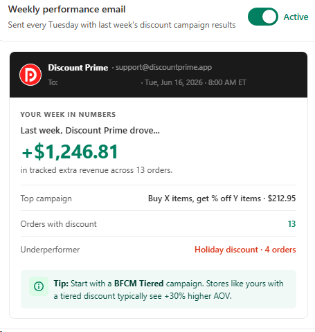
6. Weekly performance email
You don't have to open the dashboard to stay on top of your numbers. Once a week, every Tuesday at 8:00 AM in your store's timezone, Discount Prime emails you a clean one-screen recap of the previous week: total tracked extra revenue ($1,246.81 here), how many discounted orders shipped, your top-performing campaign with the exact revenue it drove, and the underperformer that's eating into margin. Each email also includes a personalized Tip of the week, a campaign suggestion benchmarked against stores like yours (for example, "Stores like yours typically see +30% higher AOV with a BFCM Tiered campaign"), so you always know what to launch next. Toggle the email on or off from Analytics in one click, no setup required.
7. Products tab: BCG matrix
We're building a dedicated Products tab so you can analyze every item in your catalog through a BCG-style matrix. Each product will be plotted by its sales momentum and margin contribution, giving you a clear view of which SKUs are stars, which are cash cows, and which need a discount push or a margin fix. With this per-product lens you can craft the exact strategy each item needs, double down on what drives profit, and turn slow movers into revenue so your overall sales reach their maximum potential.
Best for
Teams that want to measure - not guess - what their discounts do.